The Marks We Make
In this post I have gathered drawings from different artists, different centuries, and different cultures. Regardless of their individual styles, what they have in common is they made a specific effort to display variation within the marks they put down. In most drawings the change comes between material differences. But I hesitate to suggest any rule here, rather the observation that their search for differences in the application of these marks provides variety, and clarity more in line with how we experience and see in nature. But lines do not exist in nature, so the marks we choose to make and their juxtaposition has a great impact on image clarity, visual style, and how others interpret our images. These artists observed very well the rich variety and visual nuance that exists in nature then reinterpreted by clarifying variation of distinctive marks, then designating them to shapes, or zones within their images. Establishing the hierarchy between the variations of marks provides the dominant and subordinate features that also brings clarity and distinction to these images. This is a flexible concept that is evident in millions of artists' reinterpretations of our world. Some look at these many variants and pass them off as personal styles achieved through some combination of intuition and intellect.
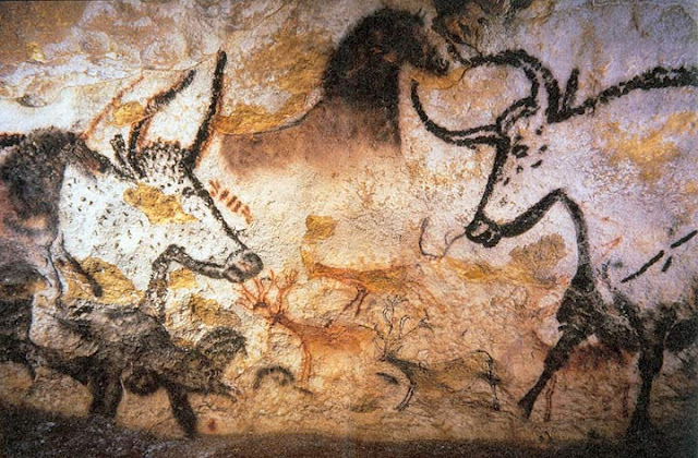
But let's look deeper at the drawings throughout the ages from the earliest cave walls to museums around the world we can begin to see the decoding of marks into Primaries of Design that gives these works timeless clarity.
Simply put, the foundation of our Style Spectrum consists of three primaries, that of Line, Mass, and Form. Visual imagery that is clear in its intent and application of marks appears to the viewer to have substantiated validity. The caligraphic and expressionistic Line does not serve Form nor Mass, it defines the surface it sits upon, if this line for line sake becomes dense in application we read it as texture. Line that implies or defines closed areas as a dominant function serves Mass. Texture that is contained within areas also supports Mass. Lines that support the presence of light and shadow supports Form. Thin Lines consistently applied to the same sides of shapes, while thicker lines are applied consistently to the opposing will imply a light direction and Form. Cross hatching of all types are lines applied for the purpose of creating the illusion of Form.
Line dominant Mass subordinate no Form
Images where the purpose of application is vague, or where the artist has not given one primary dominance appear naive or confused. Any image can contain elements of all three primaries, but its the focused intent of how we bias our marks, and transition the bias that brings clarity to our imagery.
Our Primaries of Design shares one triadic quality with primary colors. In both subtractive and additive primaries where we mix all three primaries equally we get a mixture that has no chroma, they cancel each other out. On the other hand our Primaries of Design have a dynamic quality that differs from primary colors. In our color triad, mixing two hue will result in the compliment of the third. But in our design triad it's possible to mix two and establish the illusion of the presence of the third.

In the images below look how the artists have made conscience adjustments to bias the marks within different zones, or possibly depicting different materials in an abstract manner. These are but a few artists who brilliantly manage purposeful application of biased marks.
Albrecht Durer
Line which is form dominant with subordinate areas of texture.
Line which is texture/line dominant with form subordinate.
In the landscape below defines the silhouetted shapes of trees, rocks etc., with variety of marks within the different tree types. The tree trunks, rocks and people contain lines that cross hatch to define form.
Hans Holbein
In these drawings below Holbein delicately changes the bias of his marks from one area to another.
The strongest shape with the greatest contrast is his hair. Look at the undeniable difference between that and the delicate handling of form in his face, a more simplified approach to form on his hat and lines on right side of his neck that imply form yet the lines on the clothing has little character or purpose other than outlining the division of masses.
This is a great example of a filled in hat that is mostly all mass. His hair area is line dominant and form secondary then switching to delicate form in the face and ear. The feather on his hat appears to be line with a mass bias just defining its shape.
Here is another image where the application of line has a different bias in different areas.
Hokusai
Hokusai is a master of harmonizing various types of marks. The detail does not become overwhelming because the various types of marks are contained and exist only in specific areas.
The marks contained within each zone are unique to themselves.
Robert Fawcett
Robert Fawcett was referred to as the illustrators illustrator.
In the image below he varies his line between being stronger form in some areas and texture in others.
In the delicate drawing below Fawcett is leaning into more expression of marks rather than realistic depiction which has freed him up to explore different types of marks in the hair, the face, the shirt, and the hands.
Notice the contrast of types of marks in the blue, red, and green areas. He executes variation and transitions with command of purpose.
In these sketches he hasn't lost the appearance of line while they are mostly subordinate to form and in some areas texture.
Henry Moore
In these drawings Henry More is not masking line but he uses it to cross hatch to bend the surface into the appearance of form. Some areas are dominantly form bias and subordinate areas where line is stronger.
Valentine Serov
Serov, like Holbein makes a clear distinction shifting bias from form to line. and in some areas line/texture within a mass.
Van Gough
Clearly influenced by the likes of Hokusai, Van Gough explores variation of line as texture within different zones.
Here are some examples of pencil rendering techniques that have more focus on capturing the illusion of materials, or depiction. The attention to technique to achieve such results are based on the artists intent to capture a specific likeness of materials using the pencil as a medium to depict Form and Mass through line keeping line tertiary.
Here are a few explorations in Contrast. We know that contrast draws our attention, but it's not just tonal or color contrast but contrast of all kinds. In these drawings I purposely shifted the bias of my primaries of design as demonstrated in Holbein's, and Serov's work.
Here is an illustration by Robert McGinnis. Notice his clear separation of application bias. He uses it to enhance the story telling directness. The Form region is the focal point of the subject, and the man's gaze is leading us directly to that zone.
Comparing these two images we see that they are of distinctly different bias. The left in Notan or Light/Dark contrast and the right is Form or Light/Shadow dominant. Confusion arises when we are not making clear the difference of which is the greater contrast, the local value contrast (Notan) or the contrast between light and shadow (Form or Chiaroscuro).
The Matrix is the basic design pattern of contrast. It is a good practice to begin with a simple black and white, or black, white, and grey Matrix sketch. What makes one Matrix Notan dominant and the other Chiaroscuro or Form dominant is the range of contrast. Are you separating your design by light vs Dark local values (as the image on the left), or are you separating by contrast of Light and Shadow.
What is also confusing is that many people will call a shadow shape a mass, but we cannot confuse this with our primary of Mass which is void of the effect of light and shadow, it is simply a local value mass.
Here is a fun little demonstration of our Primaries of Design


.jpg)
.jpg)


Comments
Post a Comment